
/* 3D Transform */
.tdimension {
	width: 300px;
	height: 300px;
	margin: 20px auto 40px auto;
	perspective: 1000px;
}
.tdimension a {
	display: block;
	width: 100%;
	height: 100%;
	background:linear-gradient(to bottom, #f2f5f6 0%,#e3eaed 37%,#c8d7dc 100%);
	background-size: cover;
	transform-style: preserve-3d;
	transform: rotateX(70deg);
	transition: all 0.8s;
}
.tdimension:hover a {
	transform: rotateX(20deg);
}
.tdimension a:after {
    content: '';
    position: absolute;
    left: 0;
    bottom: 0;
    width: 100%;
    height: 40px;
    background: linear-gradient(rgba(0, 0, 0, 0.2), rgba(0, 0, 0, 0.1));
   	transform: rotateX(90deg);
    transform-origin: bottom;
}
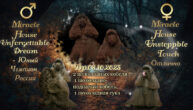
Hover Effect с пояснением
C Новым годом!
Многоглазый дед-мороз Он подарки нам принес:Шорох скрытых измерений, Тайны мертвых поколений,
Ритуальный нож и блюдо, Взгляд существ, что не отсюда,
Звезд погасших черный свет, Ядовитый лед с комет, Шупальца грибов с Юггота
Все для нового, для года!
.frame {
    cursor: pointer;
    perspective: 500px;
    position: relative;
    text-align: center;
    max-width: 300px;
    margin: 0 auto;
}
.frame img {
    max-height: 290px;
    max-width: 290px;
}
.frame .details {
    background: linear-gradient(to bottom, #f9fcf7 0%,#f5f9f0 100%) repeat scroll 0 0;
    content: "";
    height: 80%;
    left: 50%;
    opacity: 0;
    padding: 1px;
    position: absolute;
    top: 50%;
    transform: translate(-50%, -50%) rotateY(90deg);
    transform-origin: 50% 50% 0;
    transition: all 0.4s ease-in 0s;
    width: 80%;
}
.frame:hover .details {
    opacity: 1;
    transform: translate(-50%, -50%) rotateY(0deg);
}
Отсвет

/* Shine */
.hover14 figure {
    position: relative;
    max-width: 320px;
}
.hover14 figure::before {
    background: rgba(0, 0, 0, 0) linear-gradient(to right, rgba(255, 255, 255, 0) 0%, rgba(255, 255, 255, 0.3) 100%) repeat scroll 0 0;
    content: "";
    display: block;
    height: 100%;
    left: -125%;
    position: absolute;
    top: 0;
    transform: skewX(-25deg);
    width: 100%;
    z-index: 2;
}

.hover14 span {
    bottom: -10px;
    color: #444;
    display: block;
    left: 0;
    margin: 0;
    opacity: 0;
    padding: 0;
    position: relative;
    text-align: center;
    text-decoration: none;
    transition: all 0.3s ease-in-out 0s;
    visibility: hidden;
    max-width: 100%;
}
.hover14 div>figure {
    background: none repeat scroll 0 0;
    height: 300px;
    margin: 0;
    overflow: hidden;
    padding: 0;
    max-width: 320px;
}
.hover14 figure:hover + span {
    bottom: -1px !important;
    opacity: 1;
    visibility: visible;
    position: relative;
}
div.hover14 div {
    display: table-row;
    margin: 0 auto;
    max-height: 100%;
    max-width: 100%;
    padding: 0;
    position: inherit;
}
.hover14 figure:hover::before {
-webkit-animation: shine .75s;
    animation: 0.75s ease 0s normal none 2 running shine;
}
@keyframes shine {
100% {
    left: 35%;
}
}
@keyframes shine {
100% {
    left: 35%;
}
}
Можно выстроить изображения в линию заменив код!
div.hover14 div {
    display: block;
    margin: 5px 12px;
    max-height: 100%;
    max-width: 320px;
    padding: 0;
    position: inherit;
    float: left;
}
Таблички с изменяющимся цветом и фоном.
Я люблю свою работу! Я приду сюда в субботу, И конечно воскресенье. Здесь я встречу День Рождения, Новый год, 8 Марта. Ночевать здесь буду завтра. Плащ-палатка, вещь мешок — у супруга будет шок! Если я не заболею, не сорвусь, не озверею, Здесь я встречу все рассветы, все закаты и приветы! От работы дохнут кони. Ну, а я — бессмертный пони!!!
Конь педальный
Вы посмотрите – всё имеем, а жить не можем. Ну не можем жить! Никак всё нас тянет на эксперименты. Всё нам что-то надо туда, достать там, где-то, когда-то, устроить кому-то. Почему не себе?! Почему не своему поколению?! Почему этот, как говорится, зародился тот же коммунизм, бродил по Европе, призрак, вернее. Бродил-бродил, у них нигде не зацепился! А у нас – пожалуйста! И вот – уже сколько лет под экспериментом.
Черномырдин
Я тоже несу большую нагрузку. И у меня тоже голос сел. А я ведь даже вчера не пил. И другого ничего не делал. Я бы это с удовольствием сделал
Черномырдин
/* CSS Box Hover with Background Effect*/
.quotes-text {
    display: table-cell;
    float: left;
    min-height: 400px;
    width: 30%;
    z-index: 2;
    margin: 0 5px;
}
.quotes-text .box-text {
    background: #f2f2f2 none repeat scroll 0 0;
    height: auto;
    min-height: 320px;
    overflow: hidden;
    padding: 5px;
    position: relative;
    transition: all 0.5s ease-in 0s;
    width: 100%;
    z-index: 2;
    float: left;
    display: table-cell;
   border: 1px solid #ccc;
    border-radius: 10px 10px 0 0;
    box-shadow: 0 10px 6px -6px #ccc;
}
.quotes-text .box-text::before {
    background: transparent none repeat scroll 0 0;
    content: "\201C";
    font-size: 120px;
    height: 100%;
    left: 5px;
    opacity: 0.2;
    pointer-events: none;
    position: absolute;
    top: -20px;
    width: 100%;
}
.quotes-text .box-text::after {
    background: transparent none repeat scroll 0 0;
    bottom: -10%;
    content: "\201d";
    font-size: 120px;
    opacity: 0.2;
    pointer-events: none;
    position: absolute;
    right: 5%;
}
.quotes-text .box-text p {
    margin: 0;
    padding: 15px;
}
.quotes-text .box-text h2 {
    bottom: 2%;
    margin: 0;
    padding: 0;
    position: absolute;
    right: 2%;
}
.quotes-text .box-text:hover {
    color: #111;
}
.quotes-text .bg {
    height: 30px;
    left: 0;
    opacity: 0;
    overflow: hidden;
    pointer-events: none;
    position: inherit;
    top: 0;
    transition: all 0.5s ease-in 0s;
    width: 100%;
    z-index: 0;
}
.quotes-text .box-text.box-text1:hover, .quotes-text .box-text.box-text1:hover ~ .bg {
    background:  linear-gradient(135deg, #fdfcfb 0%, #e2d1c3 100%);
    opacity: 1;
}
.quotes-text .box-text.box-text2:hover, .quotes-text .box-text.box-text2:hover ~ .bg {
    background: linear-gradient(to top, #cfd9df 0%, #e2ebf0 100%);
    opacity: 1;
}
.quotes-text .box-text.box-text3:hover, .quotes-text .box-text.box-text3:hover ~ .bg {
    background: linear-gradient(to top, #c1dfc4 0%, #deecdd 100%);
    opacity: 1;
}
.col {
    align-items: center;
    display: table;
    margin: 0;
    padding: 2px;
}
@media screen and (max-width: 768px) {
.quotes-text .box-text {
  width: 100%;
}

.quotes-text {

    width: 100%;
}
}


